
First, let me assure you - your charts are not gone. They've just moved!
Now, let me explain...
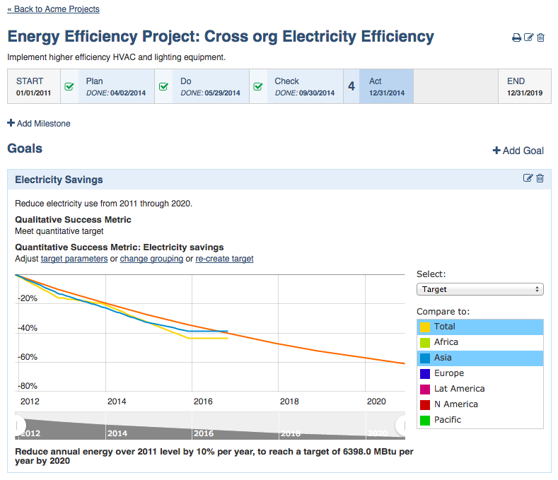
It used to be the case that you could define an arbitrary number of Goals for any Project. Then, you could quantify that goal in the form of a chart. If you chose to quantify your goal in terms of an amount, a bar chart would be used. If you chose to quantify your goal in terms of a percentage, a trend chart would be used. In either case, the charts would be presented on the same page as the project, alongside all other project parameters as illustrated in the following diagram:
Based on the evolving needs of our clients, we decided on a conceptual restructuring. The old practice of quantifying goals amounted essentially to setting quantitative targets. Generally, these were long term targets in the sense that they set a target that was typically several years in the future. Further, while the old practice supported the creation of such a target in the context of one particular project, our clients wanted to set targets for their organization as a whole, independently of any projects they may or may not have created. And - any particular target might in fact be impacted by multiple projects.
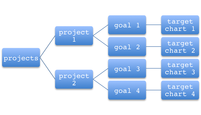
The following diagram illustrates the relationship of projects, goals and the charts that quantify them, before this restructuring:
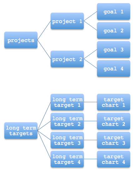
The following diagram illustrates the relationships after the restructuring:
Before the restructuring, the Projects button in the sidenav would take the user to a listing of all projects under the current node in the hierarchy. From there, the user could view any project and its goals and the target chart for each goal.
After the restructuring, a new button has been added to the sidenav - the Long Term Targets button. This button takes the user to a listing of all long term targets under the current node in the hierarchy. From there, the user can view any of the long term targets and their expression in chart form.
The Projects sidenav still exists and it still takes the user to the same project listing. When the user navigates to a particular project, the goals remain visible but the target chart that used to accompany each goal is now gone. That target chart has been moved to the long term target visualizations. Those users looking for a pre-existing target chart will find it under a long term target with the same name as the goal with which the old target chart had been associated.
This restructuring accompanies new functionality - Forecasting. Forecasting makes it possible to quantify the impact of any project on one or more trackers. The user can then choose to show the impact of a set of projects on a particular long term target. The forecasting functionality is described in a separate article.
Comments