
Custom colors can now be applied to charts throughout Scope 5. This can happen in two ways: through Themes, which determine the colors that will be used in all charts in the account, and by setting a Chart Color for any given facility.
Defining a Theme, or a group of colors, allows for company colors to be displayed in all Scope 5 charts. To set a Theme, click Themes from the left-hand side nav under the organization tab. Then click Add New Theme to identify a set of colors Scope 5 should apply in charts:
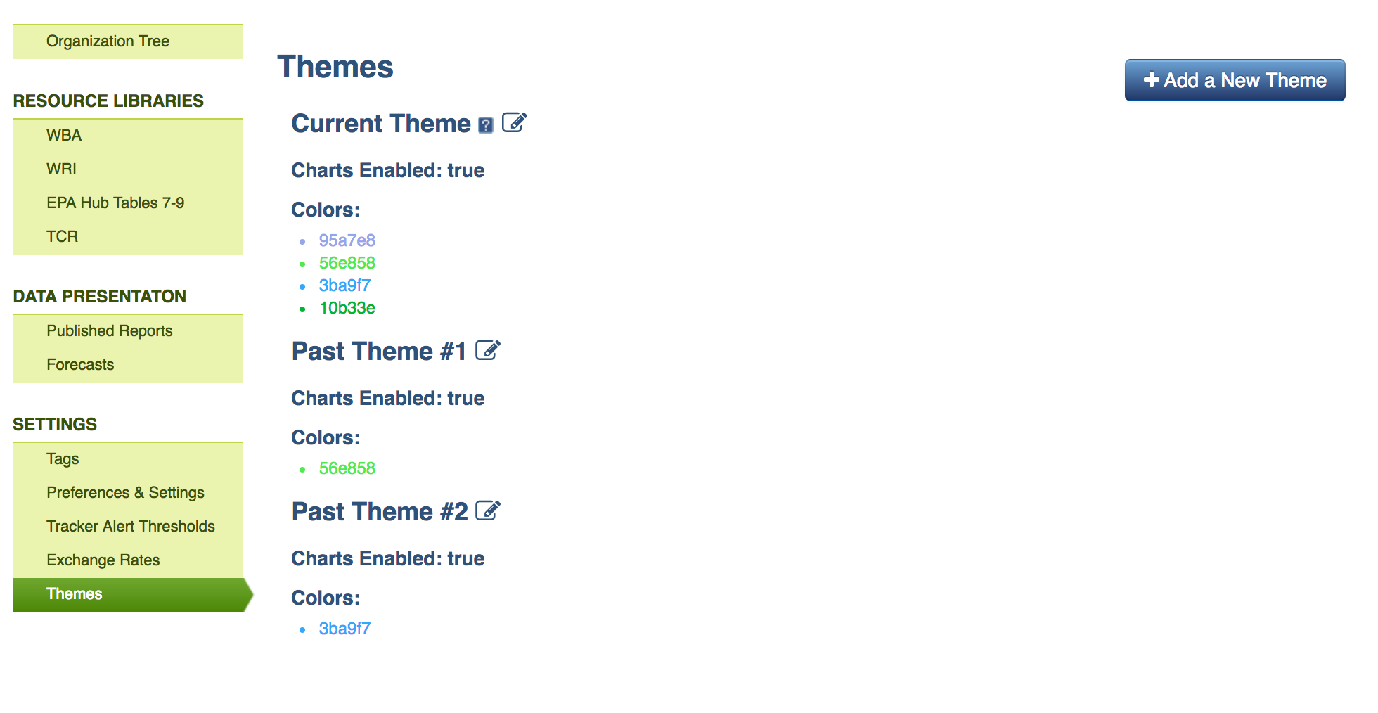
The order in which the colors are listed will define the order in which Scope 5 applies them in charts. For example, if five colors are set within a theme and a chart only compares three different data groups (for example, Scope 1, 2 and 3 emissions), the first three colors within the theme will be applied to the chart.
If five colors in a theme are set, but the chart uses color to differentiate between eight data points, then all five of the theme’s colors will be applied in the chart and, after those have been displayed, the application will pull in automatic colors.
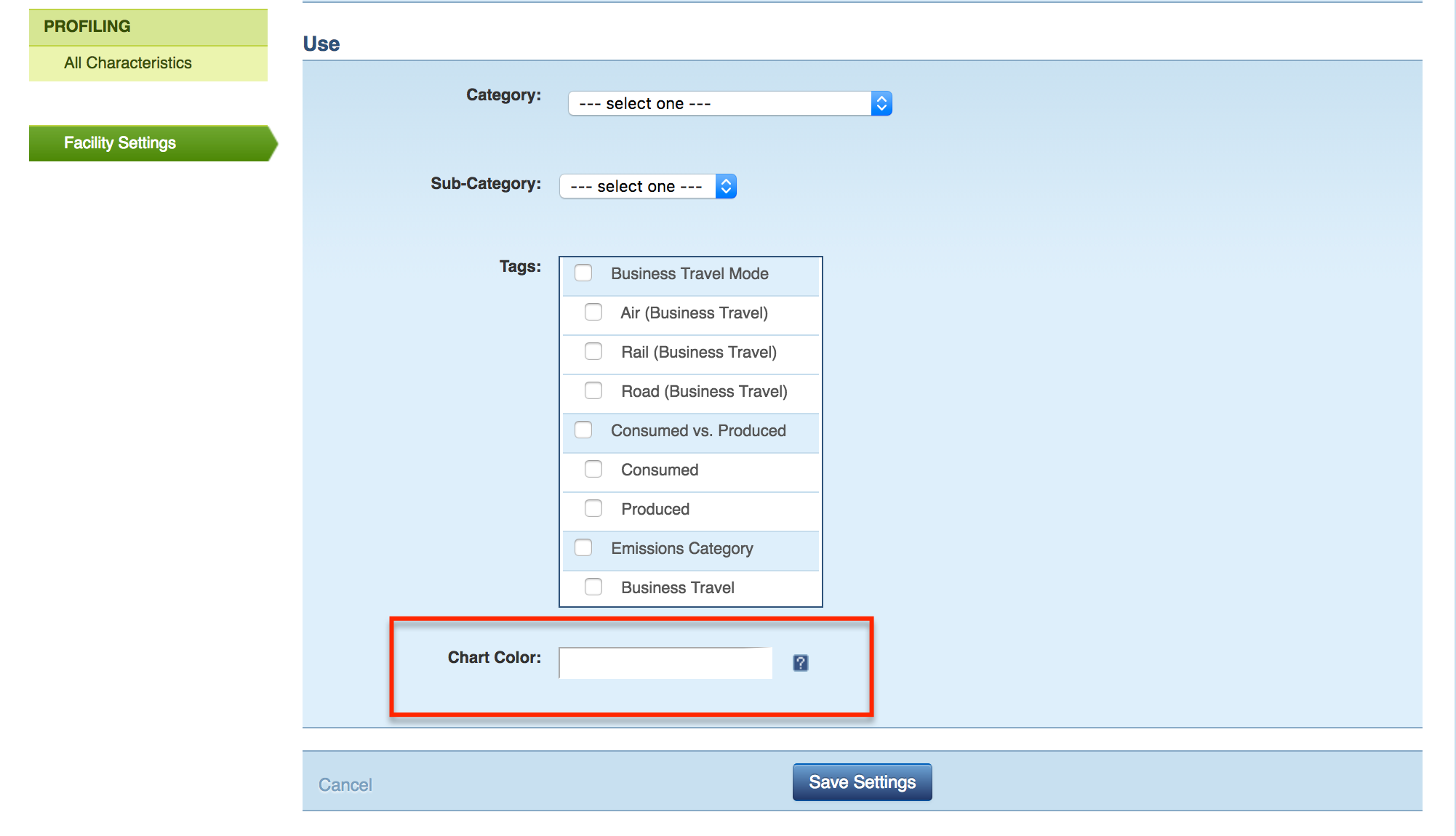
Additionally, it is possible to assign a specific color to any given facility in the account. This is done by clicking on the Facility Settings link on the left-hand side nav of any facility dashboard in the account. From this page, scroll to the bottom and see the option to identify a Chart Color:
This setting is useful for identifying a facility’s impact in any given chart and will work when the chart shows tracking nodes independently, is grouped by tracking node, and does not require color to differentiate other data sets.
Facility colors will show up in the following chart types, under the following conditions:
- Annual column charts with one year of data and with Tracking Node as the Cluster Data By selection.
- Pie charts with Tracking Node as the Compare Data By selection.
Facility color settings and Themes can be used together and are applied to charts in the following order:
- Facility colors will be used where they are set and the chart supports their use (as described above).
- If the chart uses color to differentiate facilities, but a facility does not have a unique color set, Theme colors will be used.
- If no facility colors can be used, the application will apply Theme colors in the order they are listed within the theme.
- When there are insufficient theme colors (or none) to color each of the chart graphs, arbitrary colors will be selected by the application.
For both Themes and facility Chart Colors, keep in mind that in order to make the column appear three-dimensional, Scope 5 uses the selected color for the front of the column, then darkens the color for the right side and lightens it for the top. Therefore if a light color is selected the top of the column will appear white, and, conversely, if a dark color is selected, the column will appear black on the darkened panel. We recommend choosing colors that are neither too dark or too light to avoid this.
Comments